 Ashigrain
Colour print · Print film
SuperCinecolor
Cinecolor's three-colour print on double-coated film.
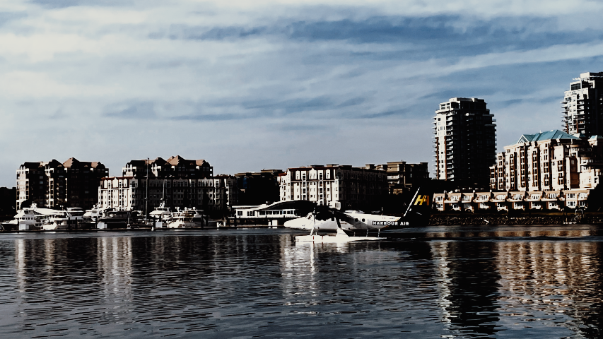
Cinecolor's three-colour print, reconstructed: its dyes, including the Prussian-blue cyan, are traced from Gundelfinger's 1950 paper, with tone borrowed from Agfa CP30. Original vs Ashigrain.
At a glance
- Introduced
- late 1940s
- Discontinued
- Process
- Cinecolor three-colour machine processing (development to silver, then toning and dyeing of the component images)
- Maximum density
- ≈ 4.0
About the film
SuperCinecolor extended Cinecolor's two-colour process to three colours, printing from three separation negatives onto duplitized positive film, coated with emulsion on both sides.
The American WideScreen Museum dates its introduction to 1948, and Cinecolor's engineer Alan Gundelfinger presented it to the Society of Motion Picture Engineers on 11 October 1949. The cyan and magenta records were printed first on opposite sides of the film and the yellow later on the cyan side. The cyan was a toned iron image of Prussian blue, while the yellow and magenta were basic dyes mordanted on a silver iodide image, and Gundelfinger called the cyan's slightly higher density in the green than in the blue the worst defect of the process. Its first feature, The Sword of Monte Cristo, came out in 1951, followed by titles such as Jack and the Beanstalk and Abbott and Costello Meet Captain Kidd (both 1952) and Riders to the Stars (1954). The Museum says Jack and the Beanstalk was shot on Eastman Color negative and printed in SuperCinecolor, and that Cinecolor used Eastman colour print film for dailies but kept its own process for release prints. Prints were judged under arc projection, and the process was also used for television series. According to the Museum, Cinecolor went out of business in 1954 and Technicolor bought its assets.
Sources for this history
- Cinecolor Three-Color Process (Alan M. Gundelfinger, Journal of the SMPTE 54, January 1950), Society of Motion Picture and Television Engineers
- Supercinecolor / Natural Color, Timeline of Historical Film Colors, University of Zurich
- Cinecolor, American WideScreen Museum
The look
SuperCinecolor was Cinecolor's three-colour print process from the late 1940s, printed from separation negatives onto film coated on both sides. Its first feature, The Sword of Monte Cristo, came out in 1951. Ashigrain reconstructs it: its dyes are traced from Cinecolor's 1950 paper, with tone and sensitivity borrowed from Agfa Print CP30.





Best for
- Early-1950s swashbucklers and fantasy
- 1950s science-fiction second features
- Comparing three-colour Cinecolor with Technicolor
Compare print films
The same Vision3 500T night frame on each print film: how deep the blacks go, how the highlights roll off and how the colour separates.
The same Vision3 500T night frame on each print film: how deep the blacks go, how the highlights roll off and how the colour separates.
The same Vision3 500T night frame on each print film: how deep the blacks go, how the highlights roll off and how the colour separates.
The same Vision3 500T night frame on each print film: how deep the blacks go, how the highlights roll off and how the colour separates.
The same Vision3 500T night frame on each print film: how deep the blacks go, how the highlights roll off and how the colour separates.
The same Vision3 500T night frame on each print film: how deep the blacks go, how the highlights roll off and how the colour separates.
The same Vision3 500T night frame on each print film: how deep the blacks go, how the highlights roll off and how the colour separates.
The same Vision3 500T night frame on each print film: how deep the blacks go, how the highlights roll off and how the colour separates.
The same Vision3 500T night frame on each print film: how deep the blacks go, how the highlights roll off and how the colour separates.
The same Vision3 500T night frame on each print film: how deep the blacks go, how the highlights roll off and how the colour separates.
The same Vision3 500T night frame on each print film: how deep the blacks go, how the highlights roll off and how the colour separates.
The same Vision3 500T night frame on each print film: how deep the blacks go, how the highlights roll off and how the colour separates.
The same Vision3 500T night frame on each print film: how deep the blacks go, how the highlights roll off and how the colour separates.
The same Vision3 500T night frame on each print film. On this two-colour print (a labelled surrogate) every colour falls between blue-green and red-orange: how deep the blacks go, how the highlights roll off and which lights keep their hue.
The same Vision3 500T night frame on each print film: how deep the blacks go, how the highlights roll off and how the colour separates.
The same Vision3 500T night frame on each print film: how deep the blacks go, how the highlights roll off and how the colour separates.
The same Vision3 500T night frame on each print film: how deep the blacks go, how the highlights roll off and how the colour separates.
The same Vision3 500T night frame on each print film: how deep the blacks go, how the highlights roll off and how the colour separates.
The same Vision3 500T night frame on each print film: how deep the blacks go, how the highlights roll off and how the colour separates.
The same Vision3 500T night frame on each print film: how deep the blacks go, how the highlights roll off and how the colour separates.
The same Vision3 500T night frame on each print film: how deep the blacks go, how the highlights roll off and how the colour separates.
The same Vision3 500T night frame on each print film: how deep the blacks go, how the highlights roll off and how the colour separates.
The same Vision3 500T night frame on each print film: how deep the blacks go, how the highlights roll off and how the colour separates.
The same Vision3 500T night frame on each print film: how deep the blacks go, how the highlights roll off and how the colour separates.
The same Vision3 500T night frame on each print film. On this blue-sensitive black-and-white print the colour negative turns grey: how deep the blacks go, how the highlights roll off and how dark the reds and greens print.
The same Vision3 500T night frame on each print film: how deep the blacks go, how the highlights roll off and how the colour separates.
The same Vision3 500T night frame on each print film. On this blue-sensitive black-and-white print the colour negative turns grey: how deep the blacks go, how the highlights roll off and how dark the red neon and skin print.
The same Vision3 500T night frame on each print film: how deep the blacks go, how the highlights roll off and how the colour separates.
The same Vision3 500T night frame on each print film. On this black-and-white print the colour negative turns grey: how deep the blacks go, how the highlights roll off and how the coloured lights and skin translate to grey.
The same Vision3 500T night frame on each print film. On this blue-sensitive black-and-white print the colour negative turns grey: how deep the blacks go, how the highlights roll off and how the coloured lights and skin translate to grey.
The same Vision3 500T night frame on each print film: how deep the blacks go, how the highlights roll off and how the colour separates.
The same Vision3 500T night frame on each print film: how deep the blacks go, how the highlights roll off and how the colour separates.
The same Vision3 500T night frame on each print film: how deep the blacks go, how the highlights roll off and how the colour separates.
The same Vision3 500T night frame on each print film: how deep the blacks go, how the highlights roll off and how the colour separates.
The same Vision3 500T night frame on each print film: how deep the blacks go, how the highlights roll off and how the colour separates.
The same Vision3 500T night frame on each print film. On this two-colour print (a labelled surrogate) every colour falls between a blue and a red dye: how deep the blacks go, how the highlights roll off and which lights keep their hue.
The same Vision3 500T night frame on each print film: how deep the blacks go, how the highlights roll off and how the colour separates.
The same Kodak Vision3 500T night frame, printed on each film.
- Kodak Vision Premier Color Print Film 2393
- Eastman Color SP Print Film 5383
- Eastman Color Print Film 5384
- Fujifilm Eterna-CP 3521XD
- Du Pont Color Release Positive Type 275
- Fujifilm Eterna-CP 3523XD
- Kodak Vision Color Print Film 2383
- Fujifilm Eterna-CP 3513DI
- Eastman EXR Color Print Film 5386
- Eastman Color Print Film 5381 (1972)
- Eastman Color Print Film 5385
- Agfa CP30 Colour Print Film
- SuperCinecolor
- Cinecolor (two-colour)
- Gevacolor Positive 953
- Gevacolor Print 9.85
- Gevacolor Print 986
- Gevacolor Print 982
- Ferraniacolor Positive
- 3M Color Positive 650
- Fujicolor Positive F-CP 3510
- Fujicolor Positive F-CP 3519
- Fujifilm Eterna-CP 3512
- Eastman Color Print 5381 (1950)
- Eastman Fine Grain Release Positive 5302
- Ansco Color Print 848
- Kodak B&W Print Film 2302
- Svema TsP-11
- Svema MZ-3
- ORWO PF 2 Positive Print Film
- Technicolor Dye Transfer (1997 revival)
- Svema TsP-8R
- Shostka Colour Positive (1950s)
- Technicolor Dye Transfer (Process IV)
- Gasparcolor Print
- Trucolor Print (two-colour)
- Kodak Vision Color Teleprint Film 2395
Science & sources
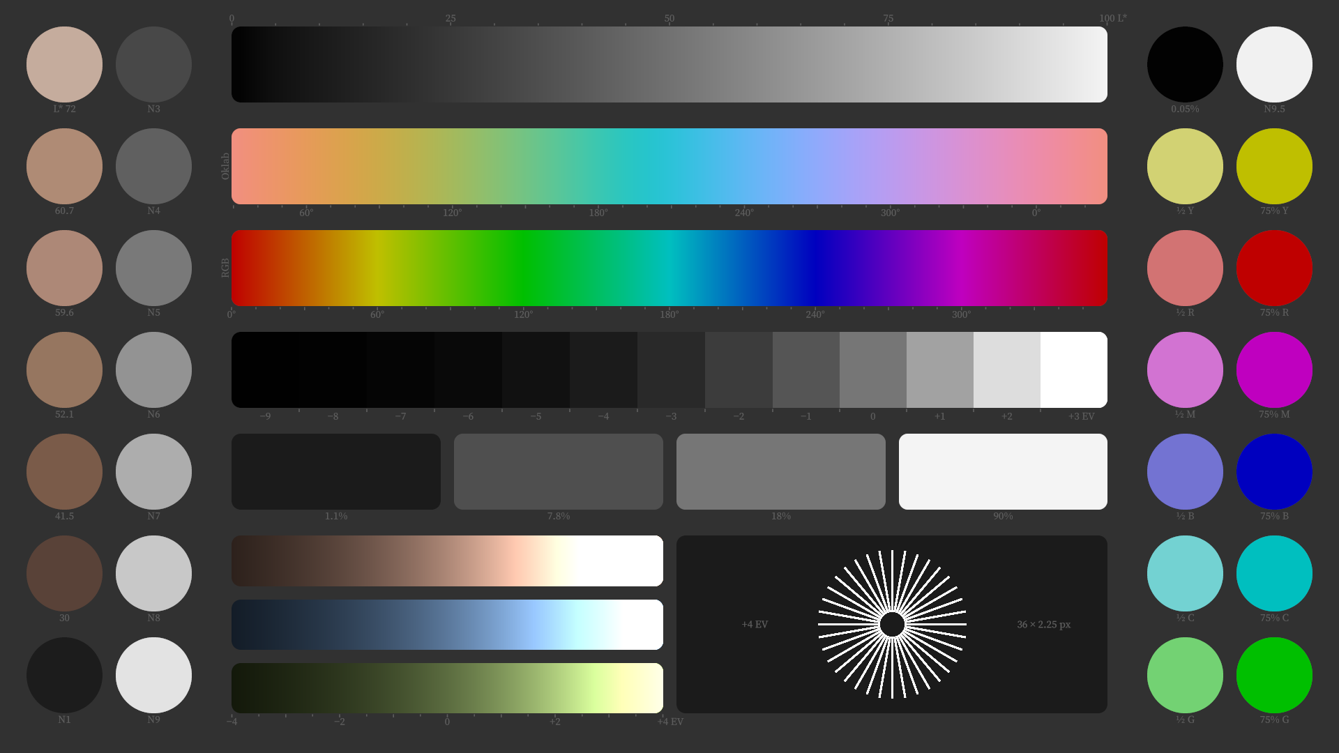
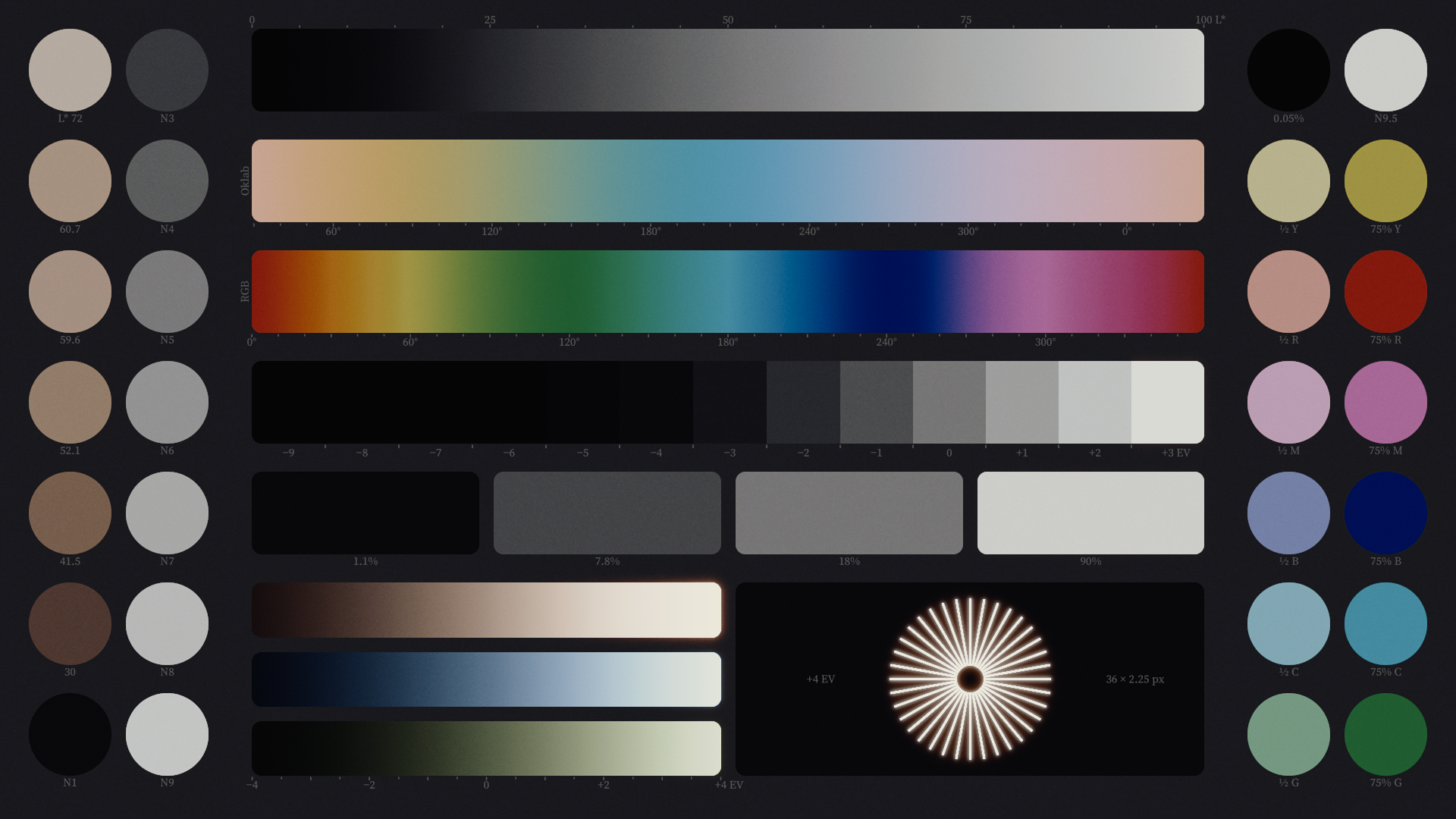
A three-colour print, shown after Ansco Color Negative 843. Its three dyes and their neutral are traced from Gundelfinger's 1950 paper; its characteristic curves and record sensitivities are borrowed from Agfa Print CP30, a proxy, because the paper prints no curve or sensitivity.
Response curves and the evidence behind the model
Compare manufacturer data with Ashigrain’s response on the same axes. These curves show how the model is calibrated to its sources; they do not establish a match to photographed film.
Characteristic response
Model limits
These images show the film model in use. Spectral response, lighting and viewing conditions include approximations. Halation, bloom, grain size, weave and flicker are not fully measured for each film. The look of real film also depends on development and print timing.
- No characteristic curve, record gamma or spectral sensitivity of SuperCinecolor is printed. The tone and record sensitivities are Agfa Print CP30's digitised curves, unchanged, a proxy rather than this process's data.
- The three dyes and their neutral are traced from a raster figure in Gundelfinger's 1950 paper, one pass. The yellow and magenta tails above 600 nm run together along the chart's lower edge and are held at that edge.
- The paper gives only the chromaticity of the projection arc (x 0.3408, y 0.3583), not its spectrum; a daylight-series spectrum at that chromaticity is assumed.
- No MTF or granularity is printed for SuperCinecolor.
- The source gives no printer lamp or filter spectra. Their spectral response is approximated.
- The available sources do not measure veiling flare during projection. The model approximates its contribution to lifted blacks on screen, so the result is not a measured projection contrast.
Reciprocity: not modelled. Exposure time has no effect on this film.
Film guide: assumptions and practical choices
This preview combines the print film with the named camera negative. In this comparison, the print has no separate exposure index or measured grain response.
Sources
- Characteristic curves: AGFA PRINT CP30 colour print film product info / technical data, 17/10/2011, p. 5